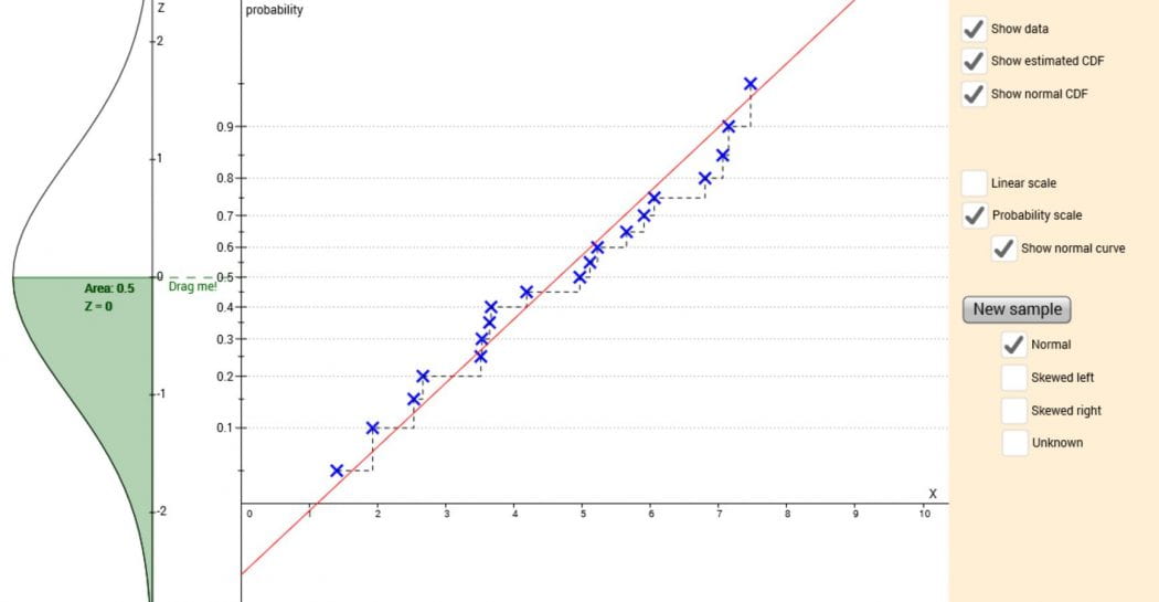
Normal probability plot and CDF
This applet shows the relationship between a plot of an estimated empirical CDF and a normal probability plot.
The applet initially shows data from a sample of size 19, sorted and plotted against the corresponding quantile on the vertical axis. Click ‘New sample’ to generate new data, or choose between a normal, left skewed, or right skewed distribution for sampling, or an unknown distribution.
Click ‘Show estimated CDF’ to show an estimate of the empirical CDF based on the data. Click ‘Show normal CDF’ to show the CDF of a normal distribution with the same mean and standard deviation as the sample.
At first, the vertical axis shows the quantiles on a linear scale. Click ‘Probability scale’ to transform the vertical axis to a probability scale. Click ‘Show normal curve’ to see the normal distribution that the probability scale is based on. Drag the dashed green line up and down to see how the two vertical axes are related.
Questions to consider:
- Generate some samples from a normal distribution. How do the data points compare to the normal CDF?
- Generate some samples from one of the skewed distributions. How do the data points compare to the normal CDF? Is it clearer with a linear or probability scale?
- Generate some samples from the unknown distribution. What do you think the unknown distribution looks like? Draw a rough sketch of a possible PDF for the unknown distribution.
Extra challenges:
- Why does the empirical CDF start/end at the minimum/maximum data point?
- What happens to the values 0 and 1 on the vertical scale as you change from a linear scale to a probability scale?
Other resources: