Partitioning of variability in regression
This applet illustrates partitioning of variability into explained (fitted) and unexplained (residual) variability,in the context of linear regression.
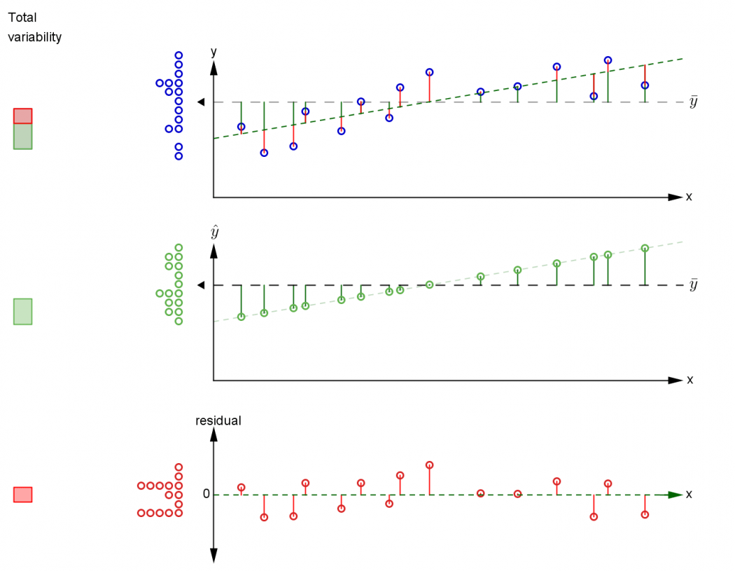
The top plot shows a scatterplot of bivariate data $(x_i, y_i)$. Drag the points to move them around. The grand $y$-mean $\overline{y}$ is shown as the horizontal line, and a dotplot of the $y$-values is shown to the left.
Click Show model to add a least squares model. You can choose to fit either a linear or quadratic model, or the null model (with no correlation between x and y).
The variability in the response can be partitioned into two sources: the variability explained by the fitted $H_1$ model (fit), and the variability unexplained by the fitted model (residual).
Click Show explained variability and Show unexplained variability to animate the two components into their own plots. Dotplots of fitted values and residuals, respectively, appear to the left. The corresponding part of the overall variability, shown in the bar to the left, is coloured.
What happens to the partitioning of variability as you change between the null, linear and quadratic models? Which model is the best fit?
Other resources:
Related applet: Partitioning of variability in ANOVA
Publication: Applets to support reasoning about explained and unexplained variability (Anthony Morphett, Sharon Gunn). In Proceedings of OZCOTS 2016